

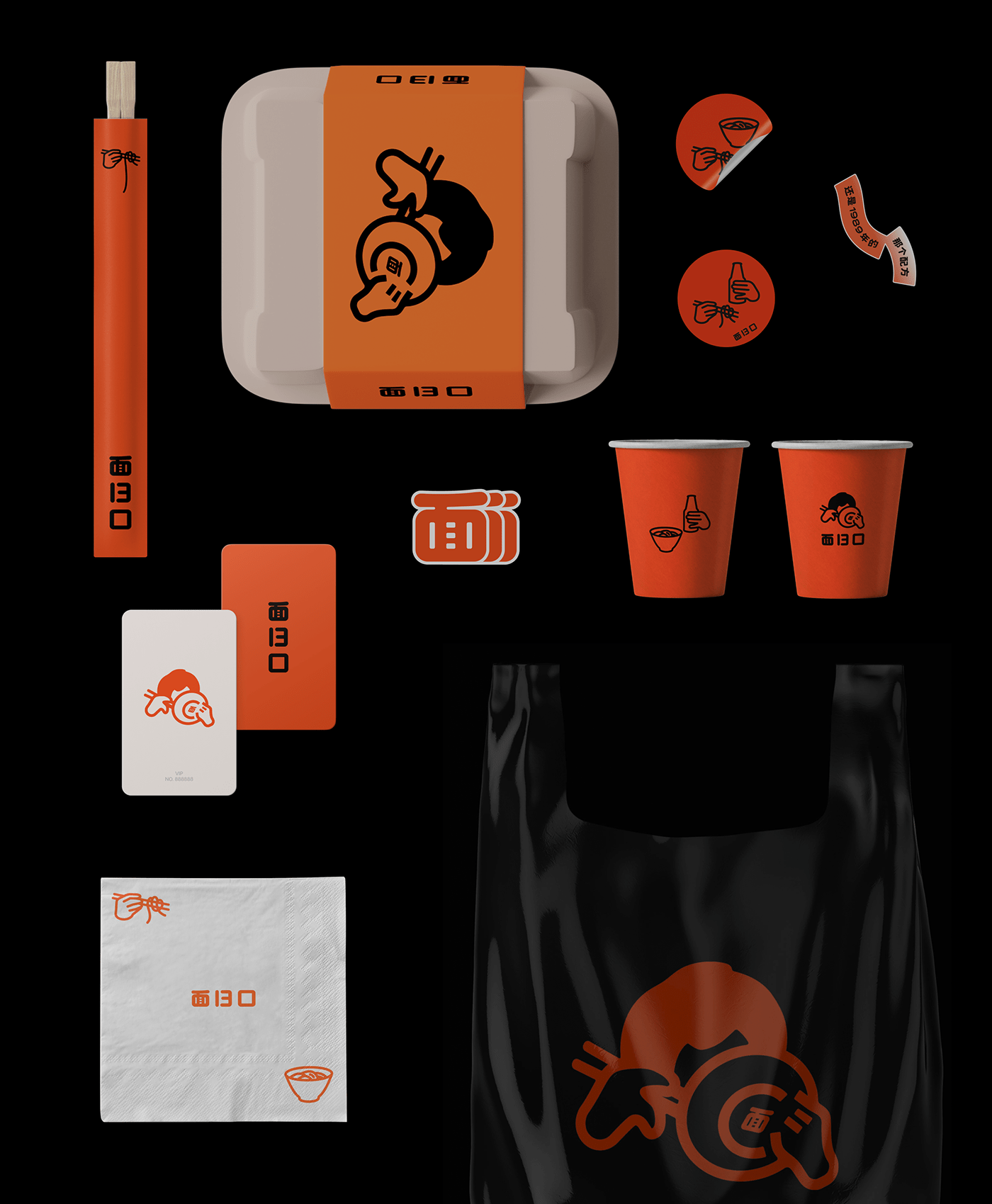
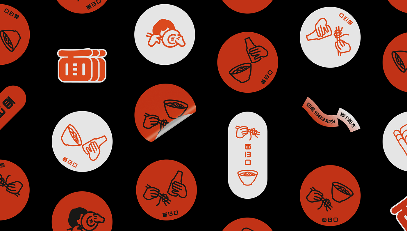
"It's still been the recipe since 1989."
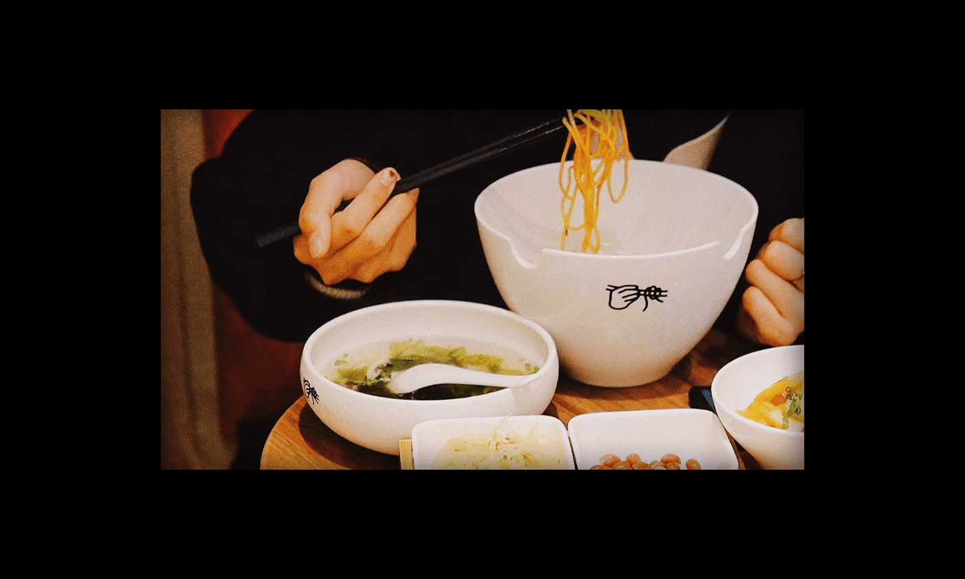
面13口 is a noodle restaurant that specializes in delivery services. It is welcomed by young people in the city and it hopes to provide consumers with classic and friendly taste. In the process of brand design, it was easy to find the team 面13口 childly and friendly, which came from their expectation and dedication to food. They hope to create a solid bond with customers, providing dishes where customers can find warmth and belonging, and go beyond the tense emotions from work.
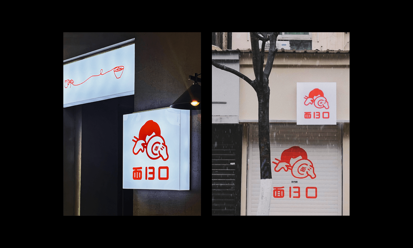
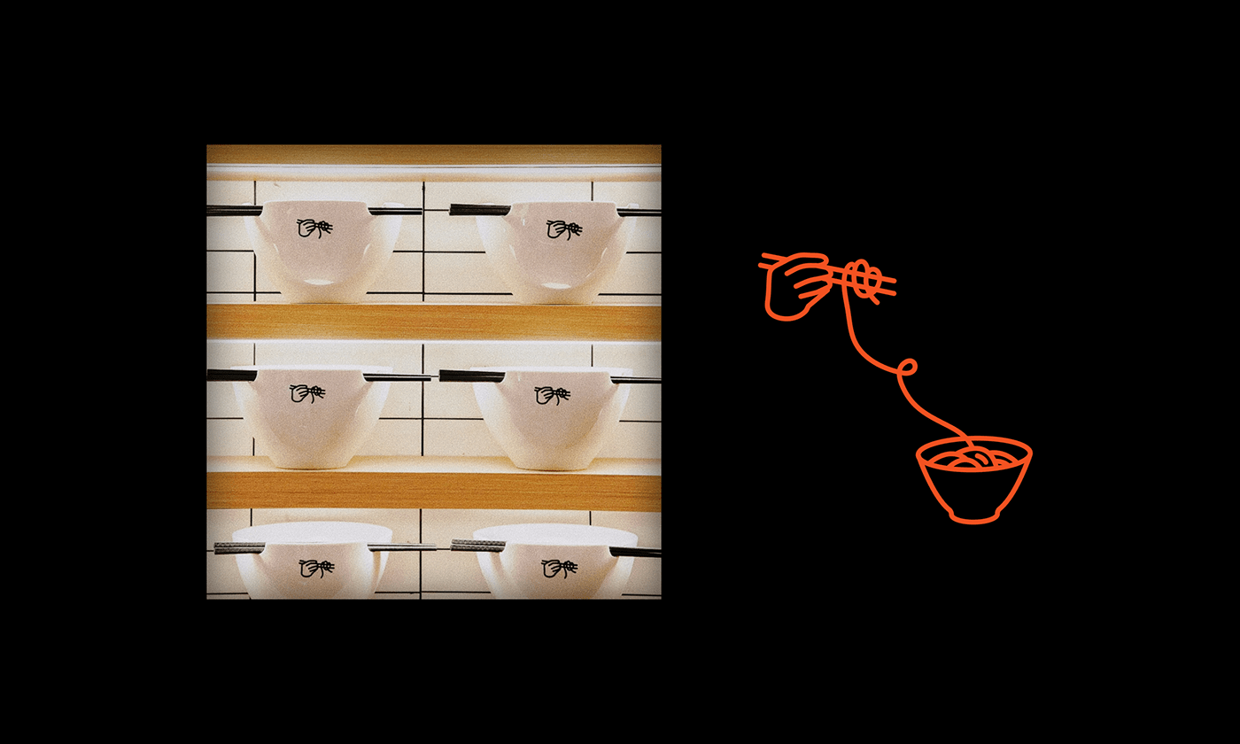
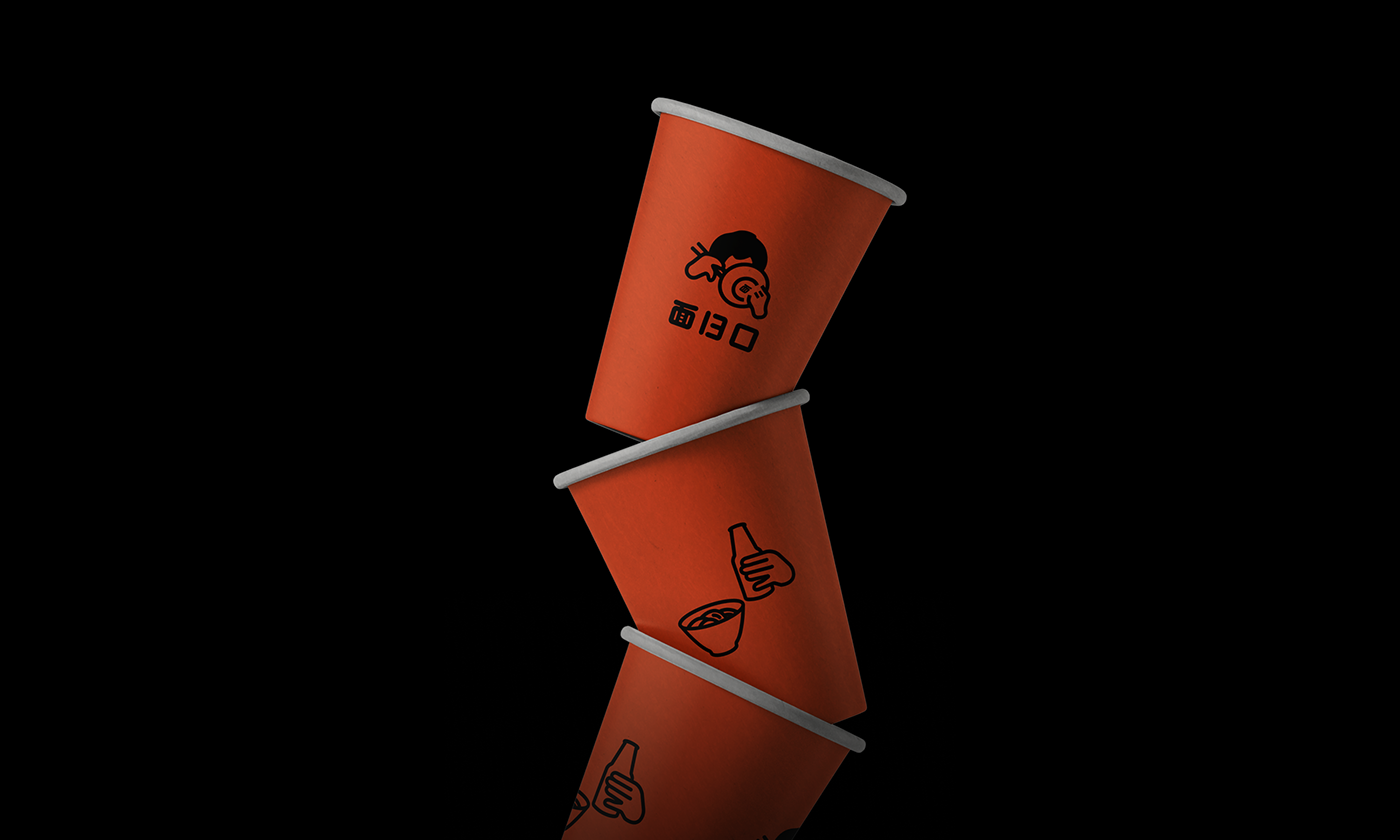
Therefore, we designed a childly and friendly logo for 面13口, The noodles are so delicious that people have to pick up the bowl and eat the last bite. Perhaps this is the touching feeling from the noodles and this is what 面13口 hopes to deliver to consumers and their friends.
Therefore, we designed a childly and friendly logo for 面13口, The noodles are so delicious that people have to pick up the bowl and eat the last bite. Perhaps this is the touching feeling from the noodles and this is what 面13口 hopes to deliver to consumers and their friends.
「还是 1989 年的那个配方」。
面13口是一家主打外送服务的面馆,它面向都市的年轻群体,希望为消费者提供经典且亲切的味道。我们在品牌设计的过程中发现,面13口的团队流露着一种既亲切又调皮的感觉,这个感觉来自于面13口对食物的期盼与执着,他们希望消费者可以在面条上寻找那份让人感动的亲切感,也希望成为消费者的朋友,期盼消费者可以在食物上放松心情、忘掉工作的烦恼。
所以,我们为面13口设计了调皮且亲切的标识,这一碗面好吃到令人不得不拿起碗吃掉最后的一口。也许这就是一碗面的感动,也许是面13口希望带给消费者、带给朋友的那个配方。
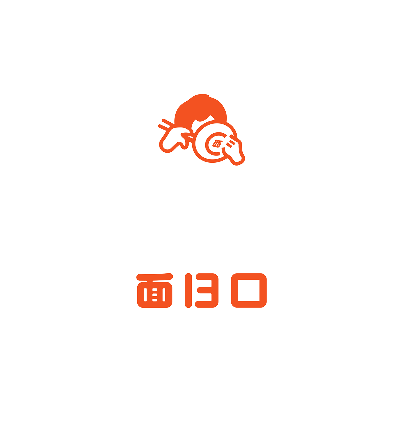
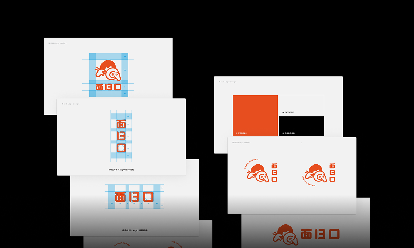
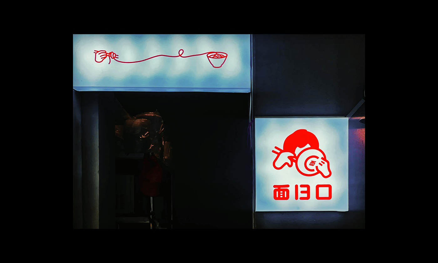


[ 面13口 ] Visual Identity
Client: 面13口
Country: Changsha·China 长沙·中国
Designer: Kwunyuk CHAN
Release date: 03/2022
Release date: 03/2022


